Project Brief
Bringing Awareness to Reproductive Rights
For this assignment, we are given the task of designing an app that has a responsive design that will work across mobile, tablet, and desktop. The application must focus attention on a civic action that will be beneficial for that community.
Proposal
In 1973, the United States Supreme Court ruled that the US would protect pregnant women's ability to have an abortion without government restriction. As of now, America is divided on overturning Roe vs Wade and having others lose their reproductive rights as a whole. This creates a variety of issues, but a major one is losing access to abortions. Getting rid of this law won’t stop abortions, but it will encourage people to seek unsafe ways to get abortions, creating more problems in turn. This would also decrease the knowledge and awareness of the subject of those struggling.
It was recorded by Planned Parenthood that “nationwide, Planned Parenthood serves 3 million women and men each year”(Fact Sheets and Reports | Planned Parenthood, n.d.). Due to this, those who need support with their reproductive rights need a space to receive support due to this current overturn. Creating an application that will give that knowledge information about reproductive rights and areas to seek support could help with this issue.
Process & Research
Approach
When approaching this project, I immediately wanted to focus on the current controversy regarding reproductive rights in America. I looked through multiple articles to see what groups affected by this law needed the most and found through my research that there is a lack of awareness regarding reproductive rights in general. After deciding on my idea, I created some initial sketches to get an idea of what my app would like visually, then brought those designs to Figma. After feedback, I finalized the designs and started to develop the prototype.
Research
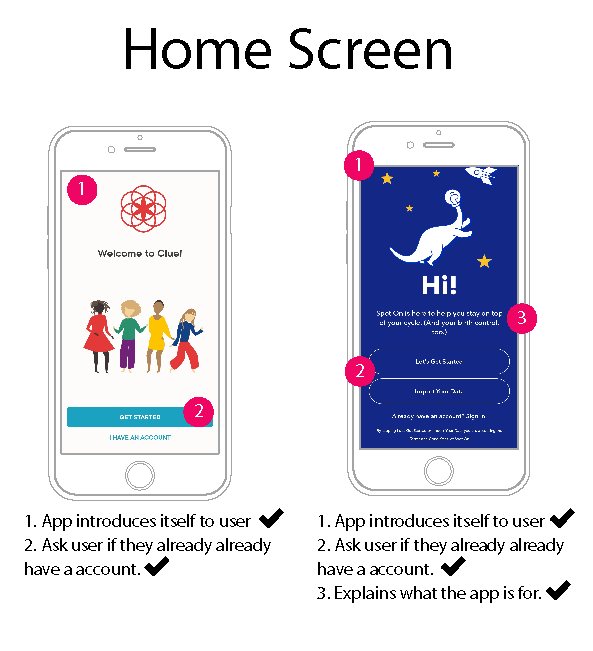
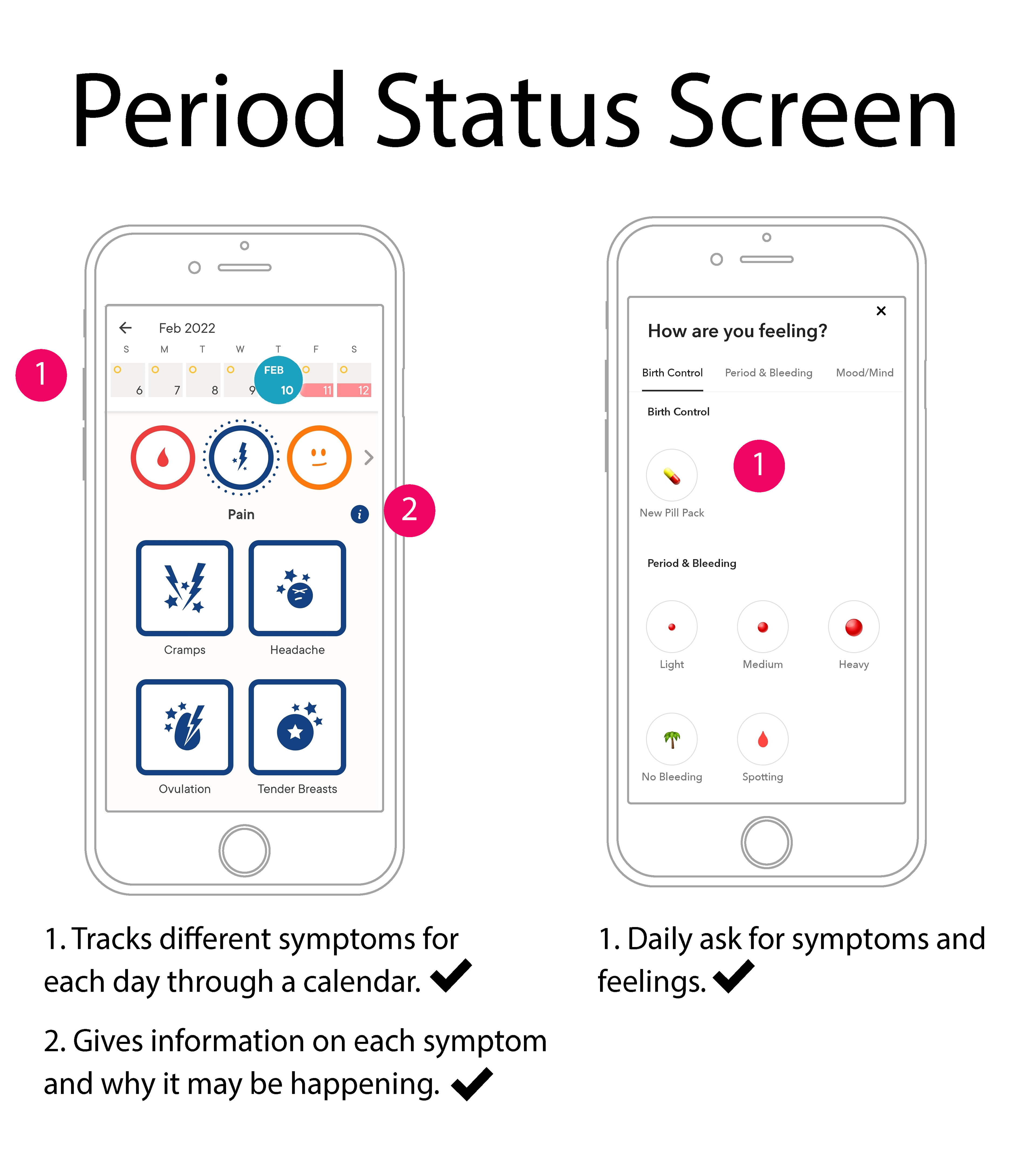
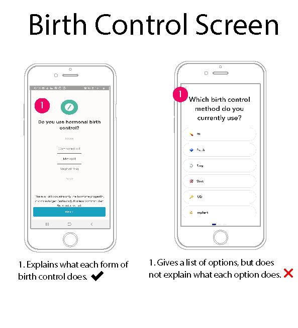
During the process of creating the visual components, I looked at other applications with similar concepts such as Clue and Spot On. The main thing I noticed with these apps is that both of these mostly focus on menstrual cycles and tracking birth control. Spot On was created by Planned Parenthood and had many features I wanted to include in my application like using non-gendered language and having a chatbot. After doing this research on these apps, I wanted mine to primarily be a safe space for those to discuss reproductive rights and find information in their area.
Competitive Audit


Flowchart
Design Feedback
During both critiques for discussion, I received feedback on the content my app will provide as well as the overall visuals. For the first round of feedback, I was given feedback on having an equal amount of educational resources and chat elements. After taking this feedback into account and creating a digital screen for my application, I gave more on the second round of feedback regarding the visuals. Many enjoyed the color scheme and overall aesthetic of the app but recommended making text and buttons smaller to make everything easier to navigate.
I also received feedback from my professor that had me reconsider certain aspects of the application like the explore page. During my proposal, I focused primarily on reproductive rights in America and I wanted my application to illustrate that. After taking all this feedback into account, I focused on finalizing my designs into a prototype that could be used across all platforms.
Prototype
